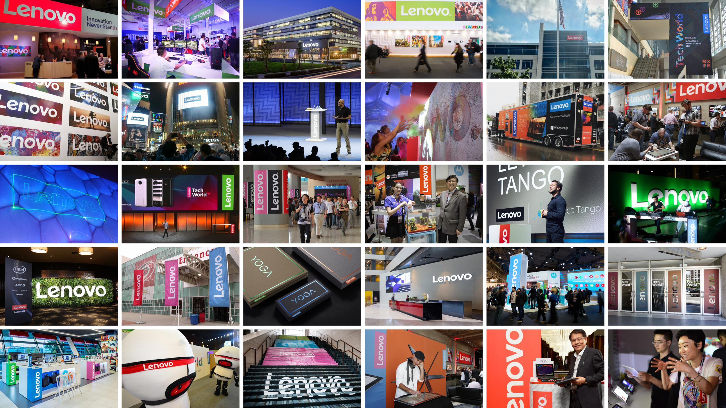
Lenovo: Brand Identity
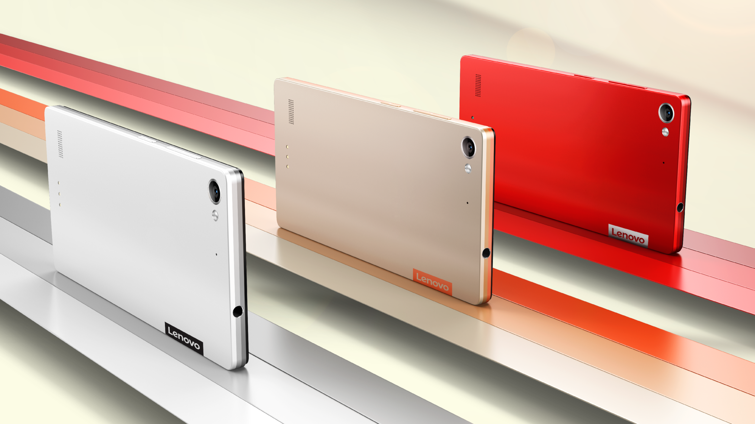
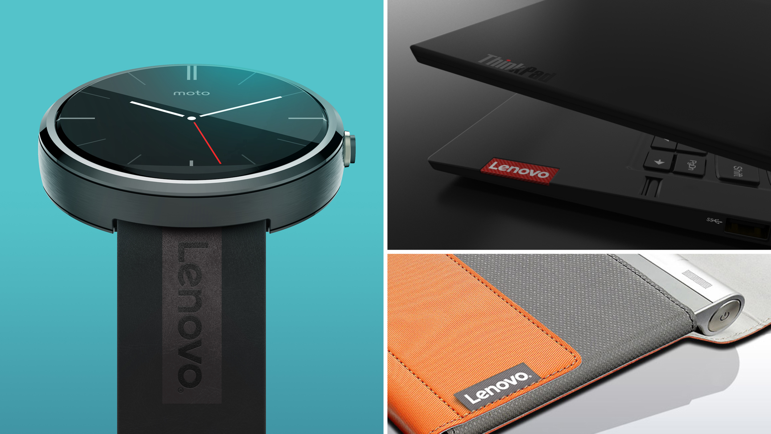
After a number of acquisitions and earning the title of the world's largest personal computer vendor, Lenovo wanted to update their identity to match their new status and future ambitions. We developed a logo that was digital first and adaptable to context inspired by the brand idea “Innovation Never Stands Still.” The Lenovo logo has a white wordmark within a containing shape. This containing shape allows for the logo to be used as a tag—a bit like a fashion brand. The containing shape allows for the logo to be used in playful way, and can be filled with color, images and textures.
Saatchi & Saatchi NY (2015)
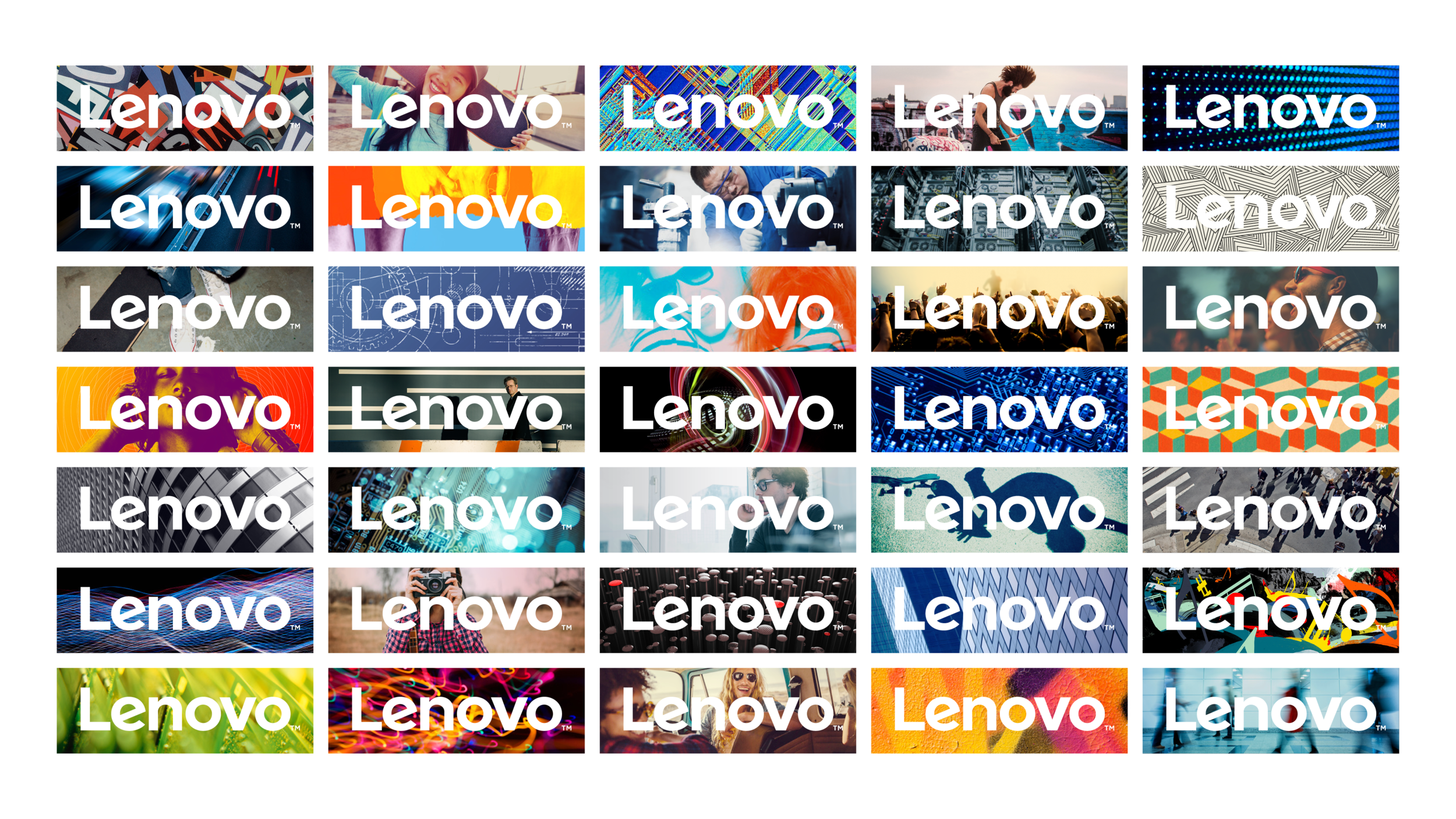
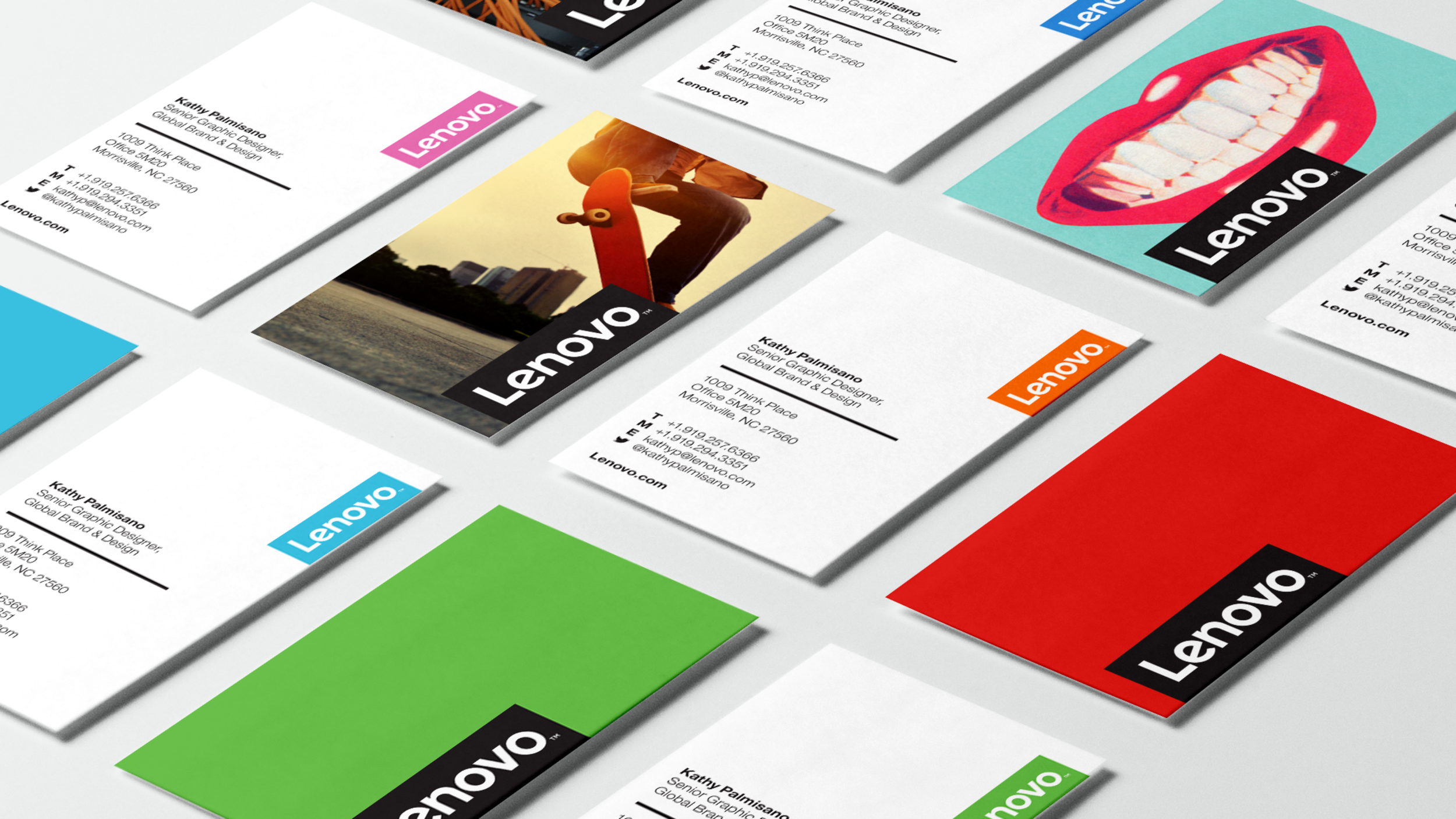
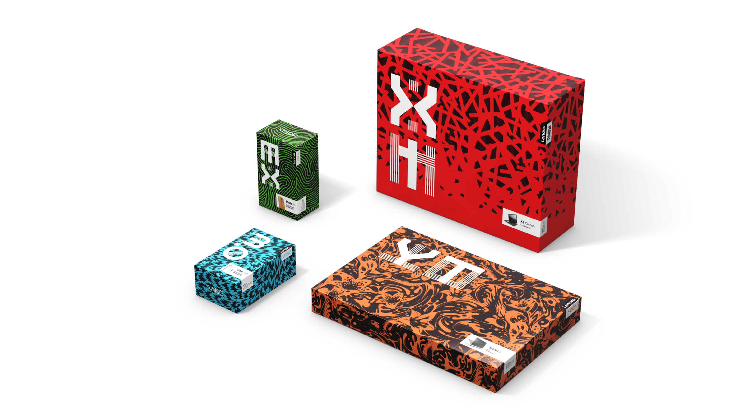
Patterns used to help sell in packaging system concept. Not commissioned by Saatchi & Saatchi.
Bespoke Type
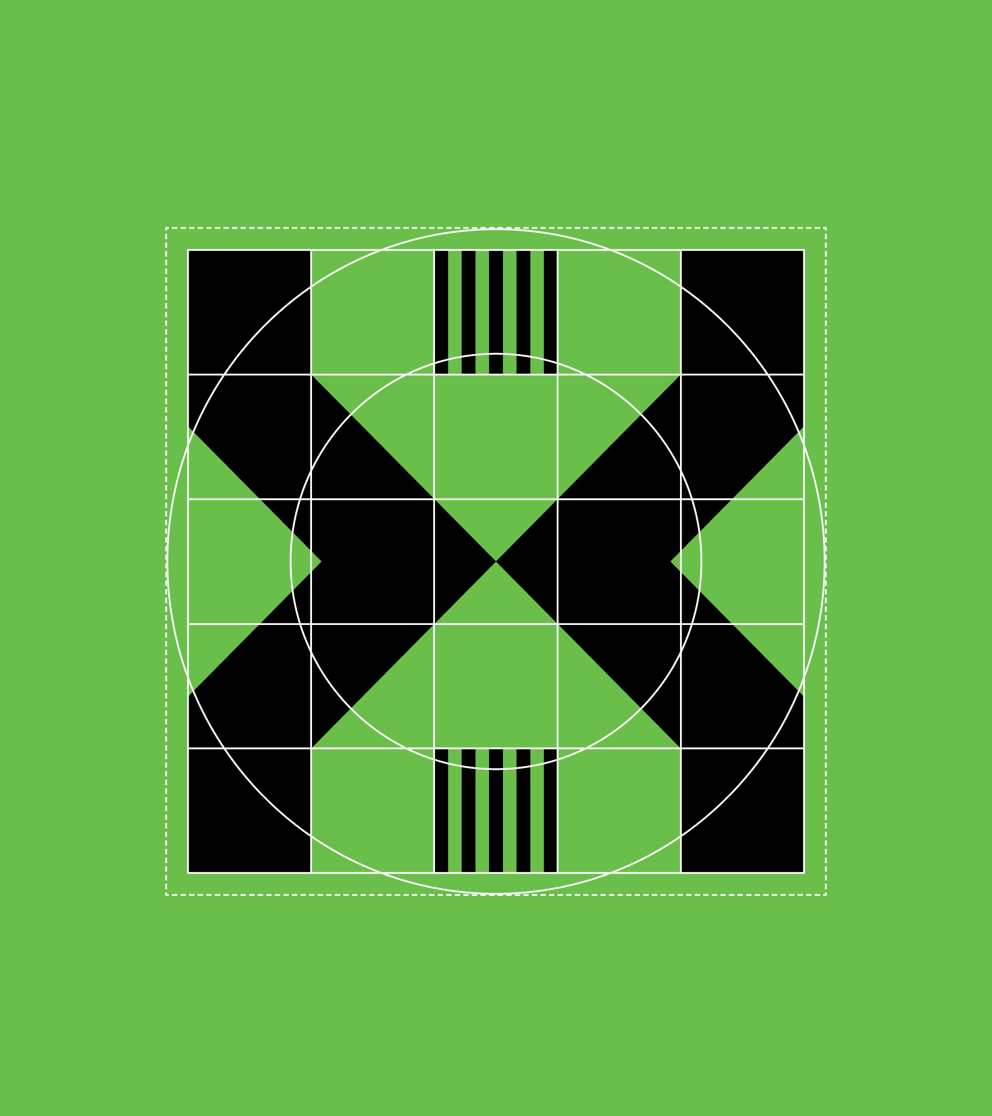
As part of the rebrand we created a bespoke typeface for Lenovo available in two styles.
The typeface is inspired by Chinese writing forms, fused with Latin characters. This fusion represents the new China as it embraces and integrates some Western values without losing its own sense of self. The geometry of squares and circles directly references two sacred forms in Chinese culture—the circle being symbolic of unity/inspiration, and the square, of man’s rules and controls.
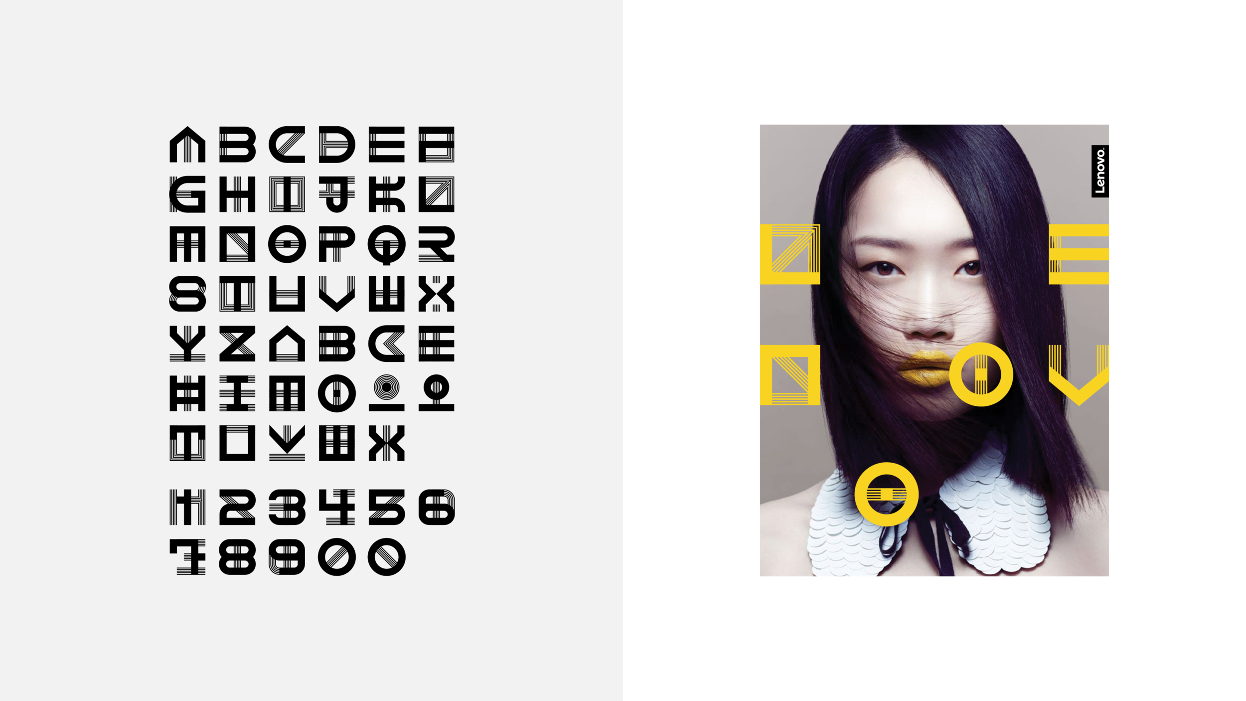
Photography used to help sell in font and design system. Not commissioned by Saatchi & Saatchi.
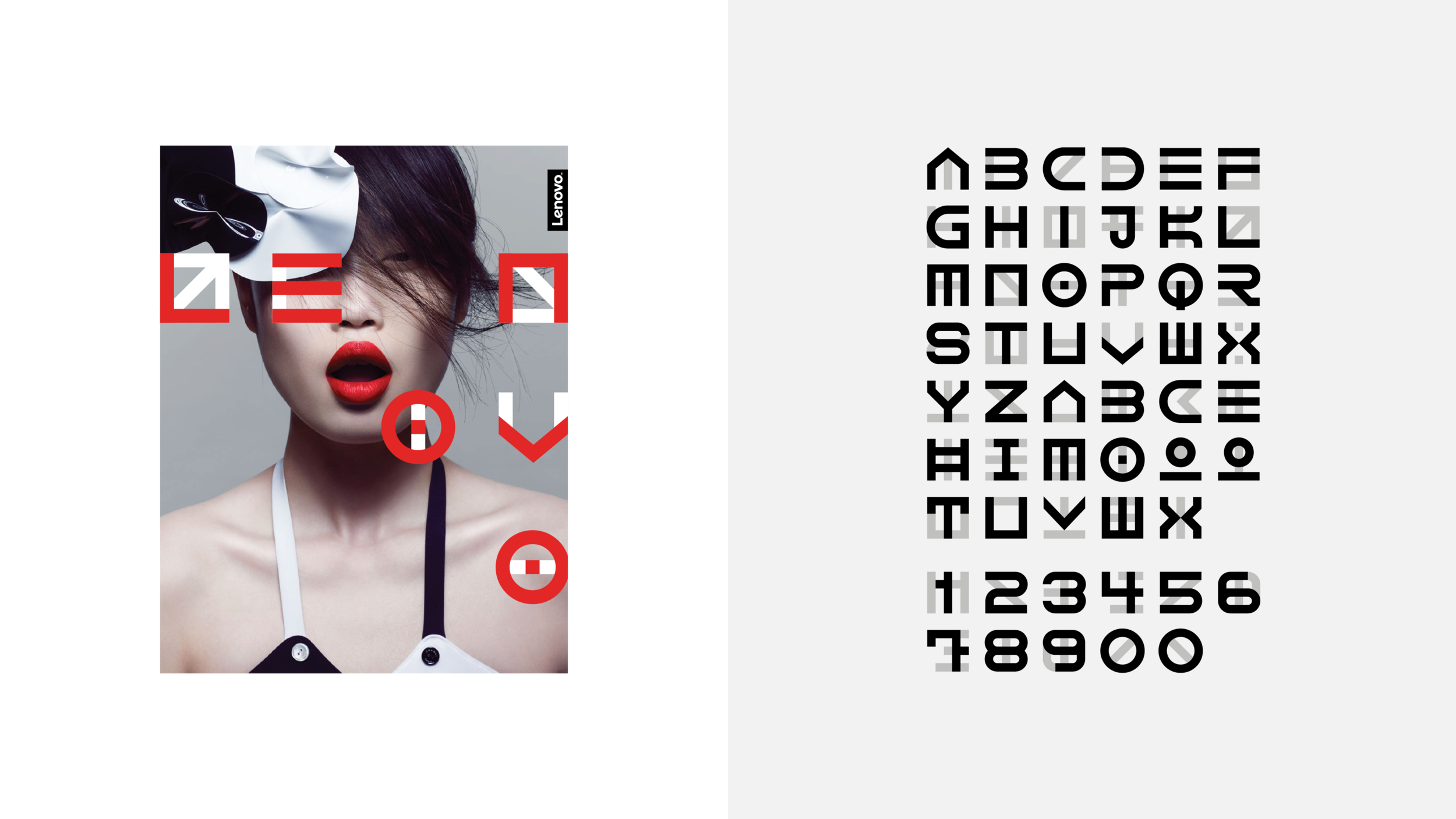
Photography used to help sell in font and design system. Not commissioned by Saatchi & Saatchi.